
©2026, technoventure, inc.
Symbolism Behind the technoVenture Logo
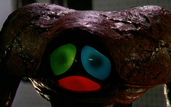
Shot from the 1953 Movie “War of the Worlds”
Initial Idea
 If you
take the T and V of TechnoVenture and superimposed them, you
get the rough outline of a triangle. Remove the vertical bar
of the T and fusing what is left with the V you get an
equalateral triangle. The ‘t’ in “technoVenture” is shown in
lower case to make the whole word look symmetrical about the
‘V’. People see a capitalized ‘V’ in the middle of the word
and think it is two words. But it is only one word. The
triangle symbolizes the triad of CPU, Programming Language
and Operating System. It represents a synergy of the three
parts of a co-designed system that breaks the “designed for
the lowest common denominator” barrier of our mainstream
platforms.
If you
take the T and V of TechnoVenture and superimposed them, you
get the rough outline of a triangle. Remove the vertical bar
of the T and fusing what is left with the V you get an
equalateral triangle. The ‘t’ in “technoVenture” is shown in
lower case to make the whole word look symmetrical about the
‘V’. People see a capitalized ‘V’ in the middle of the word
and think it is two words. But it is only one word. The
triangle symbolizes the triad of CPU, Programming Language
and Operating System. It represents a synergy of the three
parts of a co-designed system that breaks the “designed for
the lowest common denominator” barrier of our mainstream
platforms.
Finalizing the Logo
 The
aliens in the 1953 movie “War of the Worlds” (see photo at
top) further inspired the logo. If you recall, the Martians
had an eye that was divided into three separate parts in a
circular arrangement. The three parts had the colors red,
green and blue. They are the same three light primaries of
the human eye. The movie also depicts an alien camera that
is patterned after the alien eye at the end of a long
flexible probe. This is a pretty cool idea.
The
aliens in the 1953 movie “War of the Worlds” (see photo at
top) further inspired the logo. If you recall, the Martians
had an eye that was divided into three separate parts in a
circular arrangement. The three parts had the colors red,
green and blue. They are the same three light primaries of
the human eye. The movie also depicts an alien camera that
is patterned after the alien eye at the end of a long
flexible probe. This is a pretty cool idea.
I associated the three parts of the Martian eye with the triad of the ϕ System. Red represents the Processor (ϕEngine), Green represents the Operating System (ϕOS) and Blue represents the Programming Language (ϕPPL). Together they cover the full spectrum of technology needed to break free of the highly fractured foundation that our current computers are built on. The alien eye had to be flipped up side down to retain the TV/Triangle illusion in the center. Also, I didn't want it to look like a face. Reshaping the three parts made an interesting illusion appear. Notice that the middle part of the logo looks something like a womb. It represents the company playing a pivotal role in nurturing the embryonic technology to become the world's most advanced computer platform for serious hobbyists and professionals.